Creating a Shared Front-End Library with TypeScript, React, Material UI 5, and Storybook (Part 3)
TL;DR
Overview: This is the third installment of the series describing how to create a web-based user interface composed of both React and Angular micro front-ends.
The React in Angular for the first installment is an overview of how to embed a React component in an Angular app. The second installment describes how to refactor and adapt different parts of an existing React app to create re-usable components in a shared library. This third installment is a recipe for putting it all together as a re-usable npm library.
Benefits: To balance the stability of our mature Angular micro-apps with the ease of innovation of React for creating components that can be reused across both Angular and React, we curated the following tech stack to build this shared component library:
- Typescript enables typing support to improve code clarity and improve developer productivity;
- Storybook allows component developer and other team members to verify the component visually and locally before being pushed to code library;
- The React Material UI library provides high quality foundation of a solid design system to jumpstart demanding business needs and user experience;
- Jest and testing-library provide unit test framework;
- Rollup builds and bundles the source code into output library.
Pre-Requisites: Before we start, we have the following pre-requisites installed:
- Node 12+ and NPM
- git (optional)
Step 1: Create a Typescript and React NPM project
Starting from a blank slate, we create an empty folder and initialize both git and npm, then add typescript and react:
$ mkdir my-lib
$ cd my-lib
$ git init
$ npm init
$ npm i -D react react-dom @types/react typescript
We add the following to tsconfig.json to configure the typescript compiler:
{
    "compilerOptions": {
        "target": "es5",
        "outDir": "./lib",
        "lib": [
            "dom",
            "dom.iterable",
            "esnext"
        ],
        "declaration": true,
        "declarationDir": "./",
        "allowJs": true,
        "skipLibCheck": true,
        "esModuleInterop": true,
        "allowSyntheticDefaultImports": true,
        "strict": true,
        "forceConsistentCasingInFileNames": true,
        "module": "esnext",
        "moduleResolution": "node",
        "resolveJsonModule": true,
        "isolatedModules": true,
        "noEmit": true,
        "jsx": "react-jsx"
    },
    "include": [
        "./src"
    ],
    "exclude": [
        "node_modules",
        "lib"
    ]
}
Note that we put source code in src folder and build output in lib folder.
Step 2: Add Storybook, Material UI, and Jest Test
In step 2, we incorporate several key elements for the development environment.
Run the following commands to initialize Storybook, add React Material UI, and add Jest & React Testing Library support:
$ npx sb init
$ npm i -D @mui/material@5 @mui/styles@5 @emotion/react @emotion/styled
$ npm i -D @testing-library/jest-dom @testing-library/react @types/jest babel-jest jest ts-jest storybook-addon-material-ui5
Use the following code in .storybook/main.js to add Material UI support to Storybook:
module.exports = {
"stories": [
"../src/*/.stories.tsx"
],
"addons": [
"@storybook/addon-links",
"@storybook/addon-essentials",
'storybook-addon-material-ui5'
],
"framework": "@storybook/react"
}
To verify the use of custom styling, we create the src/theme.ts file, add custom branding and make adjustment to the breakpoints for responsive design:
import { Theme } from '@mui/material'
import { createTheme } from '@mui/material/styles'

const theme: Theme = createTheme({
  palette: {
    primary: {
      main: '#490e4b'
    }
  },
  breakpoints: {
    values: {
      xs: 0,
      sm: 600,
      md: 1025,
      lg: 1280,
      xl: 1536
    }
  }
})

export default theme
We create a simple Button component in the file src/components/Button.tsx as a sample component:
import React from 'react'
import { Button, styled } from '@mui/material'

const ButtonStyled = styled(Button)(({ theme }) => ({
  borderRadius: 2,
  [theme.breakpoints.down('md')]: {
    width: '100%',
  }
}))

export default ({ size, children, ...props }: any): React.ReactElement => (
  <ButtonStyled size={size} {...props}>
    {children}
  </ButtonStyled>
)
To support import of several common static files, we create the src/files.d.ts file:
declare module '.woff'
declare module '.woff2'
declare module '.png'
declare module '.svg'
declare module '*.jpg'
Export the Button component and theme in the src/index.ts file:
export { default as theme } from './theme'
export { default as Button } from './components/Button/Button'
Storybook Support
Add theme to Storybook with the following code in .storybook/preview.js:
import React from 'react'

import { ThemeProvider } from '@storybook/theming'

import theme from '../src/theme'

export const decorators = [
  (Story) => (
    <ThemeProvider theme={theme}>
      <Story />
    </ThemeProvider>
  ),
]

export const parameters = {
  actions: { argTypesRegex: "^on[A-Z].*" },
  controls: {
    matchers: {
      color: /(background|color)$/i,
      date: /Date$/,
    },
  },
}
Create the src/components/Button/Button.stories.tsx file:
import React from 'react'
import { Meta } from '@storybook/react/types-6-0'
import Button from './Button'

export default {
  title: 'Components/Button',
  component: Button,
  argTypes: {
    size: {
      options: ['small', 'medium', 'large'],
      defaultValue: 'medium',
      control: { type: 'radio' }
    }
  }
} as Meta

export const Primary = (props: any) => <Button variant="contained" {...props}>Primary Button</Button>
export const Secondary = (props: any) => <Button variant="outlined" {...props}>Secondary Button</Button>
At this point, you can run npm run storybook to view the Button component in storybook:
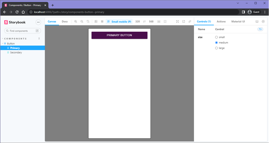
The Storybook framework is a great time-saver that allows us to preview the components in different scenarios without being integrated in the hosting micro apps first.
Support Jest Test Scenarios
To support unit test with jest and testing-library, we add the following files:
src/
  components/
    Button/
      Button.test.tsx
  test/
    mocks/
      fileMock.js
    setupTests.tsx
    sizeWrapper.tsx
babel.config.js
jest.config.js
Edit file src/components/Button/Button.test.tsx:
import { render } from '@testing-library/react'
import SizeWrapper from '../../test/sizeWrapper'

import Button from './Button'

describe('Button', () => {
  it('should match snapshot', () => {
    const { container } = render(
      <Button>My Button</Button>,
      { wrapper: SizeWrapper }
    )

    expect(container.firstChild).toMatchSnapshot()
  })
})
Edit file src/test/mocks/fileMock.js:
module.exports = 'test-file-stub'Edit file src/test/setupTests.tsx:
import '@testing-library/jest-dom/extend-expect'

jest.mock('react-dom', () => {
  const original = jest.requireActual('react-dom')
  // https://medium.com/@amanverma.dev/mocking-create-portal-to-utilize-react-test-renderer-in-writing-snapshot-uts-c49773c88acd
  return {
    ...original,
    createPortal: (node: any) => node
  }
})
Edit file src/test/sizeWrapper.tsx:
import { ThemeProvider } from '@mui/material/styles'

import theme from '../theme'

const SizeWrapper = ({ children }: any): JSX.Element => (
  <ThemeProvider theme={{ ...theme, props: { MuiWithWidth: { initialWidth: 'lg' } } }}>
    {children}
  </ThemeProvider>
)

const SmallSizeWrapper = ({ children }: any): JSX.Element => (
  <ThemeProvider theme={{ ...theme, props: { MuiWithWidth: { initialWidth: 'sm' } } }}>
    {children}
  </ThemeProvider>
)

export { SmallSizeWrapper }

export default SizeWrapper
Edit file babel.config.js:
module.exports = { presets: ['@babel/preset-env'] }Edit file jest.config.js:
module.exports = {
    preset: 'ts-jest',
    transform: {
        '^.+\\.(ts|tsx)?$': 'ts-jest',
        "^.+\\.(js|jsx)$": "babel-jest",
    },
    moduleNameMapper: {
        "\\.(gif|png|jpg|ttf|eot|svg|woff|woff2)$": "<rootDir>/src/test/mocks/fileMock.js"
    },
    testEnvironment: 'jest-environment-jsdom',
    setupFilesAfterEnv: ['<rootDir>/src/test/setupTests.tsx']
};
Now you can run npx jest --coverage to exercise the test script, or add it to the scripts section of package.json:
"test": "jest --coverage",Step 3: Build with Rollup and Publish
We install rollup and relevant packages for the build:
$ npm i -D rollup @rollup/plugin-commonjs @rollup/plugin-image @rollup/plugin-node-resolve @rollup/plugin-typescript rollup-plugin-peer-deps-external rollup-plugin-postcss rollup-plugin-urlMake updates to package.json:
- Verify the package name is what you want, here we use:
"name": "@kkr/tech-demo" - Set up the library files to come from the build output director lib:
"main": "lib/index.js",
"module": "lib/index.js",
"types": "lib/index.d.ts", - Move
dependencies(if any) todevDependencies; - Copy the following from
devDependenciestopeerDependencies:"peerDependencies": {
"@emotion/react": "^11.9.0",
}, - Add the
filessection:"files": [
"src",
"lib"
], - Add the build script in
scriptssection:"build": "rollup -c",
Add rollup.config.js with the following code:
import peerDepsExternal from 'rollup-plugin-peer-deps-external'
import resolve from '@rollup/plugin-node-resolve'
import commonjs from '@rollup/plugin-commonjs'
import typescript from '@rollup/plugin-typescript'
import postcss from 'rollup-plugin-postcss'
import url from 'rollup-plugin-url'
import png from '@rollup/plugin-image'

const packageJson = require('./package.json')

export default {
  input: 'src/index.ts',
  output: [
    {
      file: packageJson.main,
      format: 'cjs',
      sourcemap: true
    }
  ],
  plugins: [
    peerDepsExternal(),
    resolve(),
    commonjs(),
    png(),
    typescript({ tsconfig: './tsconfig.json' }),
    url({
      // by default, rollup-plugin-url will not handle font files
      include: ['**/*.woff', '**/*.woff2'],
      // setting infinite limit will ensure that the files
      // are always bundled with the code, not copied to /dist
      limit: Infinity,
    }),
    postcss({
      extensions: ['.css']
    })
  ]
}
At this point, we can build and publish to the npm repository:
$ npm run build
$ npm publish
Verify that the library was published correctly to either the public or private NPM repository you have setup (e.g. AWS CodeArtifact, Verdaccio, etc.).
There you have it, setting up a feature rich React component library suitable for both Angularjs and React, with Typescript, Material UI 5, Storybook, and Jest unit test.
You can now leverage this approach to re-use several major components, including the header, footer, and feedback form.
Credits and References:
- Matej Muza
- Prateek Surana: Creating a React component library using Storybook 6
- What is NPM (Node Package Manager)?: https://docs.npmjs.com/about-npm
- What is Git?: https://git-scm.com/
Disclaimer
The views expressed in each blog post are the personal views of each author and do not necessarily reflect the views of KKR. Neither KKR nor the author guarantees the accuracy, adequacy or completeness of information provided in each blog post. No representation or warranty, express or implied, is made or given by or on behalf of KKR, the author or any other person as to the accuracy and completeness or fairness of the information contained in any blog post and no responsibility or liability is accepted for any such information. Nothing contained in each blog post constitutes investment, legal, tax or other advice nor is it to be relied on in making an investment or other decision. Each blog post should not be viewed as a current or past recommendation or a solicitation of an offer to buy or sell any securities or to adopt any investment strategy. The blog posts may contain projections or other forward-looking statements, which are based on beliefs, assumptions and expectations that may change as a result of many possible events or factors. If a change occurs, actual results may vary materially from those expressed in the forward-looking statements. All forward-looking statements speak only as of the date such statements are made, and neither KKR nor each author assumes any duty to update such statements except as required by law.